|
History Mapping Used for Non-Historical Purposes
It often happens that historical mapping is used contemporarily for political, tourist, social or psychological purposes. Below are some obvious cases of such distortions. |
|
Click on the minimaps for an explanation
|
|
|
| euratlas |
| Historical Atlas |
| Atlas historique |
| Physical Atlas |
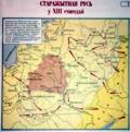
The chosen country is shown as a timeless and ideal entity, as "it should be" or as "it should have been" without scientific relation to its historical evolution. Generally, in such maps, the boundaries are based on actual historical borders carefully chosen across the centuries in order to fit an ideal area.
A relatively common variant of the "Promised Land" map consists of showing the boundaries existing at the date of the map creation overlaid by an historical map.
An author takes the liberty of drawing an imaginary country, or the "great & perfect" outline of an ancient entity, with all the appearances of scientific truth. There are several ways to reach such an aim. It is possible, for instance, to consider various little known tribes as a single group, or to treat an area where one cultural fact, such as industry, language or religion, dominates as a single entity, or to carefully select out of 2000 years those 3 to 5 years during which the controlled territory was particularly wide.
Generally, such political entities never existed or existed for such a short period of time that the map literally becomes a hoax.
A map shows a modern country, or an entity beloved by the author, as an isolated and independent whole with little consideration for the adjacent areas or for the course of its historical evolution.
In such maps, the neighbouring countries are drawn like "terrae incognita" (unknown lands) and the drawer does not hesitate to graphically "annex" large portions of their territory.
Of course, some of these maps are flanked by commentary in which it is stated that the drawing does not represent reality or that it represents only an ancient reality but, in any case, the drawing can still make a mark in the minds of its readers.
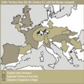
While most historical maps show factual elements such as countries, cities, and roads , there are still some maps, often inherited from 19th century mapping, in which the author tries to introduce biological factors. Some human entities, theoretically related by their DNA, are mentioned under the name "races" or "ethnic groups". In such maps, the colours or graphics are chosen in such a way that the reader is lead to believe that various small tribes had a feeling of belonging to a higher entity, sometimes called a "nation".
Except for language, religion, or technical skills, it is particularly difficult to prove indubitably the existence of such higher entities. In fact, these tribes were fighting each other and their evolution was dependent upon a continuously changing alliance game in which language or religion was not always the main factor.
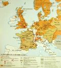
Sometimes an author or a commentator gives in to the temptation to increase the influence of a map by adding various symbols like strokes, circles, arrows, sparks, etc. Of course, his aim is to explain the sequence of some historical events but, in doing so, he transforms a descriptive image into a graphic explanation of his own theory about a particular moment in history. In most cases, the reader who sees such a map is not able to discriminate between facts and hypotheses.
Despite the claims or ideas implied by their authors, such historical charts by no means constitute the scientific confirmation of a theory. Ultimately, their utility lies only in the illustration of a current of thought of which author is the spokesman.


